Sunday 13 March 2011

Final Models - Task 1


These photographs show my final model for Task 1. I have hung these to show how they would be displayed in the atrium.

I have tried to capture the shadows in this image. I like how the models look as if they are floating like planets.

I decided to experiment with lighting and I think this image improves the look of the models. The light it alot brighter which creates darker shadows.

Close up of one of the models also showing that the inside is also quite interesting.


Experimenting further with lighting and colour editing.

Constructing Final Model For Task 1

I have chosen the model which I will be using for my final piece. I started by making each section and I needed 60 pieces for each model. I thought 3 models would be suitable so that they can be hung similar to the way in which planets are displayed.


These are the pieces which are put together to make the model.


From experimentation throughout the project I knew that I would need to also add some glue to the slotted sections as it was previously not strong enough to be hung. These photo shows how each section is fitted together.

This is one finished section. Each pentagon that I create as to be surrounded by five hexagons.


This is the model when it is nearly finished. Adding the glue has made the model a lot stronger and it can now be hung successfully.

Final Poster For Task 2


This is my final poster for Task 2 of the project. I am quite happy with the outcome and I think the different elements of my poster work well together. I think I have represented GF Smith Paper well.

Ideas For Final Poster

These are the final compositions for my poster. I have decided on a type style and images but I have just experimented with the layout to see which is most successful. This first example is'nt the best layout as I think the images are a bit big and take your eye away from what the poster is advertising.


I like this layout as the models look as if they are hanging which was my initial idea and I think this works well. I think the text needs to be displayed more equally though as there is only one piece of type and the bottom.


I really like how simple this design is but as I made three different models for this part of the project I really wanted to show all the models and try and create a layout so they look as if they are hanging like the example above.


I think this is the most successful poster design out of these. The models look as if they are hanging and relate to the way planets are display which I really like. The text is also more equal in this composition which I think works a lot better.

Wednesday 9 March 2011

Imagery Ideas

Even though I had development a model for the poster I still decided to look at some of my other models and make sure the final model was still the most suitable for the poster format. Here are just a few experiments with different imagery.


I decided that the models that I orginally design were going to be most suitable for the poster. I like the idea of including all three models in the final piece and making them look as if they are hanging like planets. Here is an idea of what I would like. I still need to think about how I will add the type and ensure that all required information can fit in the poster.


Tuesday 8 March 2011

Experimenting With Type

I have began to looks at different ways of creating type for the poster. I was really inspired by some of the examples that I have looked at during research. Below you can see a technique which I came across earlier. I have cut letters out of white paper and then screwed them up into small balls. I then unscrewed these which revealed a nice textural effect. The type was based on an impact style font because I found that alot of the advertising for GF Smith contains very bold simple fonts.


I then experimented with using stencils. I really like the simplicity of both these examples but as it doesnt really relate to paper in any way I am unsire whether it would be suitable.


As I liked the use of brown paper before I have decided to use it again by placing a stencil over the top.


Just experimenting with changing the colours behind the stencil. I prefer the brown paper as it has a most textural look.

Neville Brody

I came across the work of Neville Brody when I was looking for inspiration from other typographers. I first noticed his alphabet which I really like as its so simple. I think I font similar to this would work really well on the poster.


I also came across this design which I really like. I like the use of both black and white text and I think the white type looks really good against the dark background. The font also works really well.


In this piece I really like the boldness of the colours and how the letters are made from simple shapes. I want my poster to be this simple but also this eye catching.

Monday 7 March 2011

Creating Letters from Paper

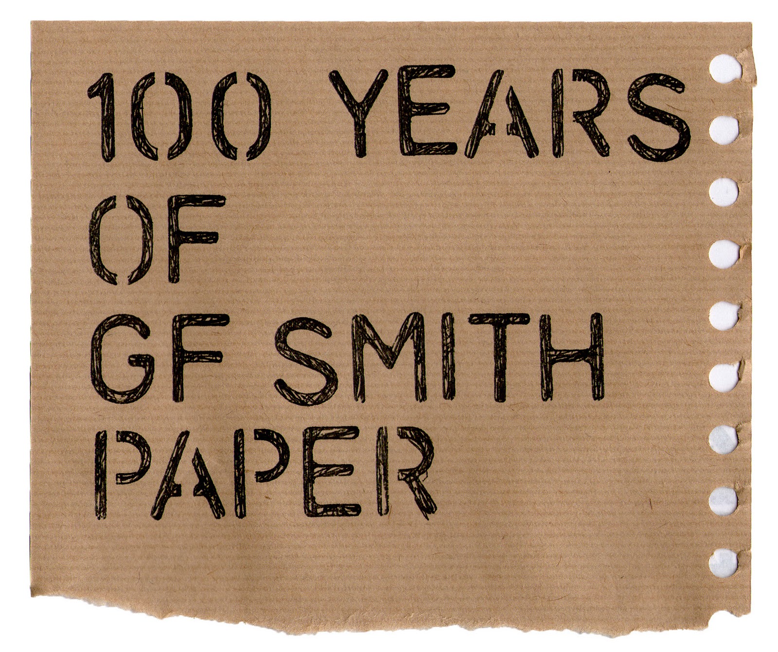
I started to research various ways people to create letter forms using paper. I thought this may be a interesting way to create the type aspect of the poster. I especially like the example below where the paper has been creased and then layed out. I think this works well with along with the bold lettering.


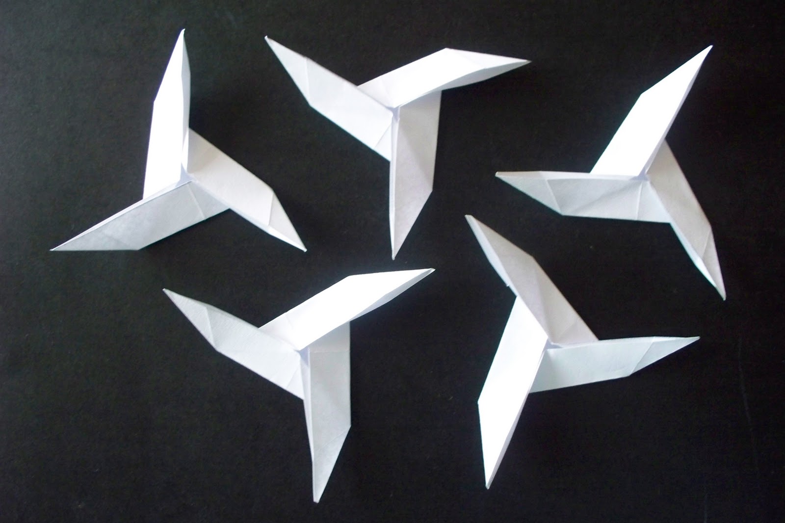
I also like the folding techniques used on this example. I like the angles found in the letters and this could work well with the images of my final paper model this is also very angular.


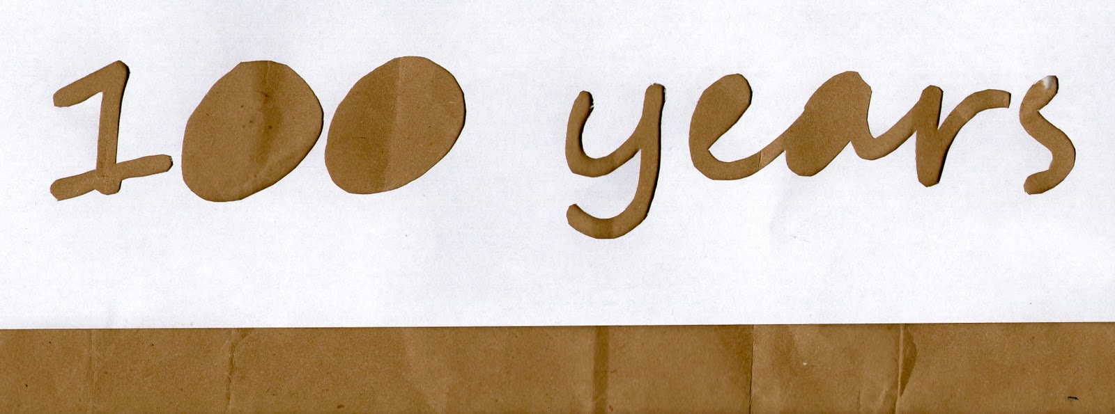
This simple design is also interesting but it wouldnt work aswell in a final poster as I dont think the type is as easy to read as the other examples I have looked at. I struggled to read what this actually said and I am still unsure of what a few of the words say. This technique would not be suitable as the viewer would struggle to understand what the poster was advertising. However I could experiment using a similar technique but ensuring that the letters are clearer.

This is a very simple idea but effective. The paper has just been screwed up and bent and arranged into the shapes of letters. It looks as if the paper used was from a magazine or newspaper and I like how you can randomly see various colours in some of the letters.


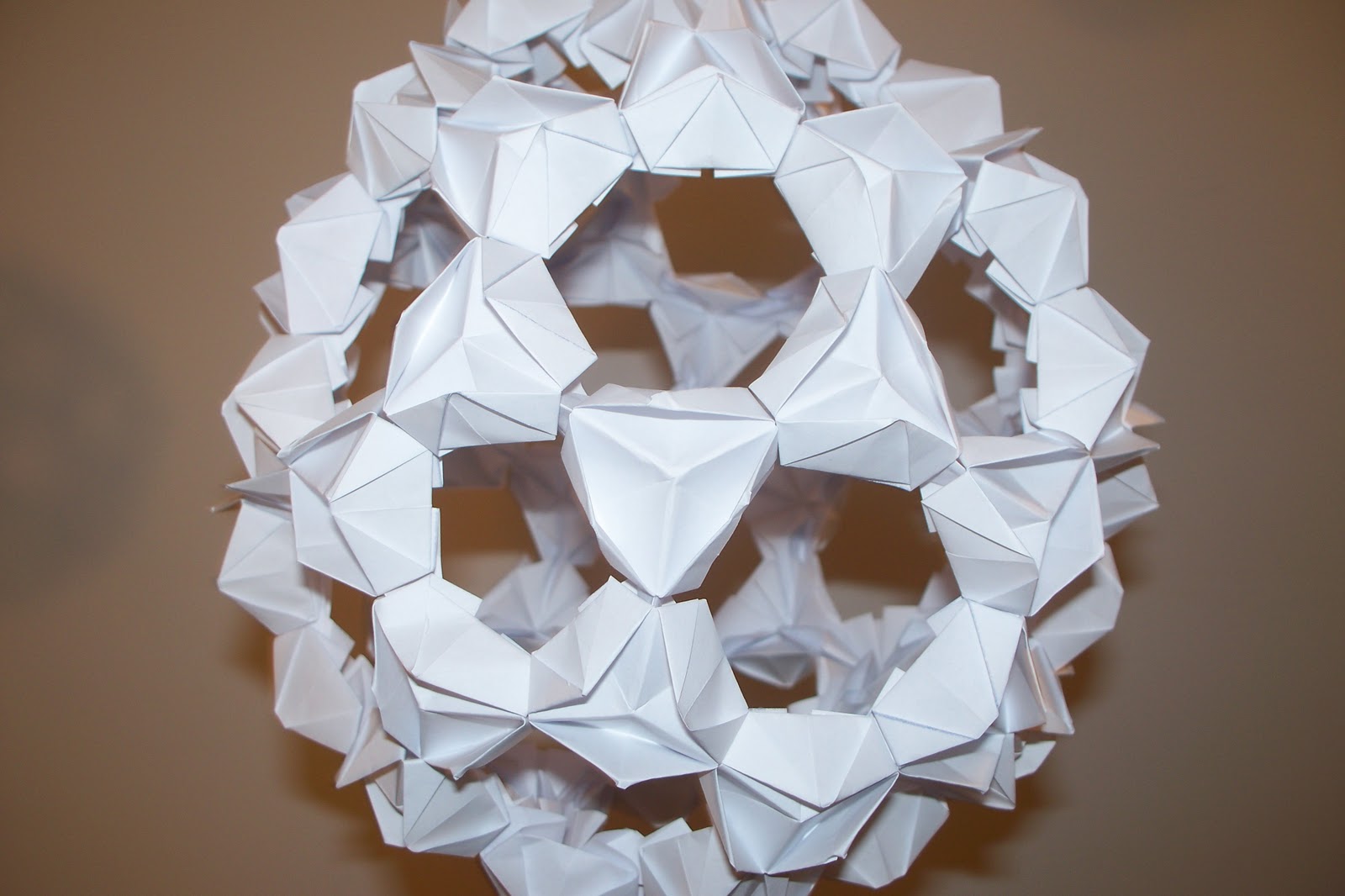
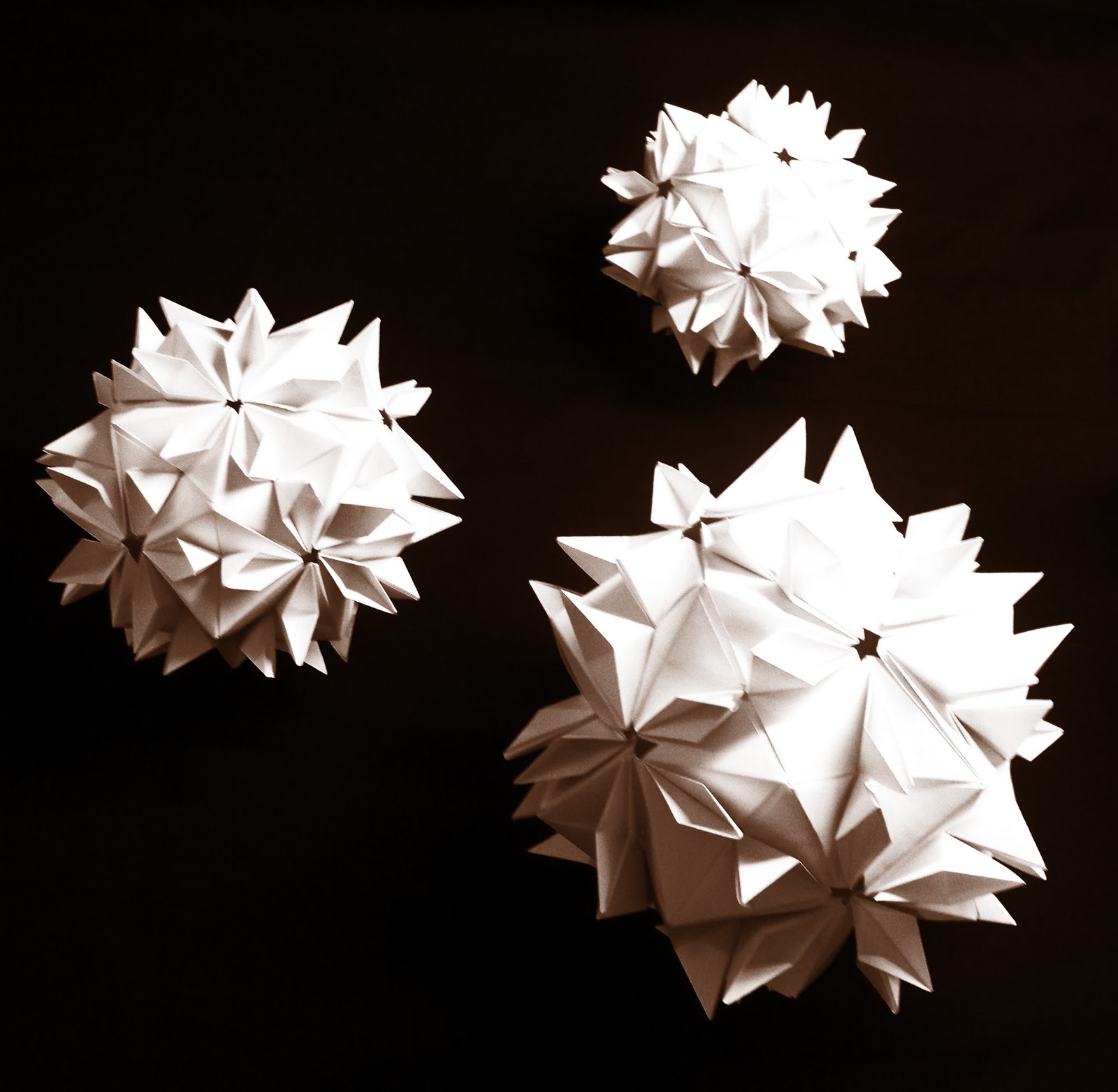
I picked a few images where you can see how paper works really effectively.


Sunday 6 March 2011

Task 2: GF Smith Paper


For Task 2 I am required to design a poster advertising the 100 years of GF Smith Paper Company. I decided to do some initial research on the company to get an idea of what they are like. I gathered these images showing some advertising for the company. I noticed that the type is very similar on all these example. I like how bold and bright the type is so I will try to use a similar type and style in my poster.


Flower Models for Poster - Task 2

For the poster design I decided that I wanted to use these models. I created three different sized models for this part of the project. Even though Task 2 doesnt require any of the models to be hung I did anyway and photographed them as I thought they may work well on the poster this way. I used the influence which I got from my research about planets and displayed my models in a similar way.


Now I have a final model I will be experimenting with how I can use my photographs and adding them into a poster. I could experiment with colour and lightening effects.